The Tone Curve. Once everyone's favorite tool in Photoshop has been relegated to backup adjuster in Lightroom. Let's be honest, when was the last time you used it? It's been a while hasn't it? That's ok, I understand, the sliders and Graduated Filter and all the other options in Lightroom have made the Tone Curve a bit of an afterthought. But that doesn't mean it isn't useful or you should continue to ignore it! It still has plenty of life left and we'll talk about it in this post.
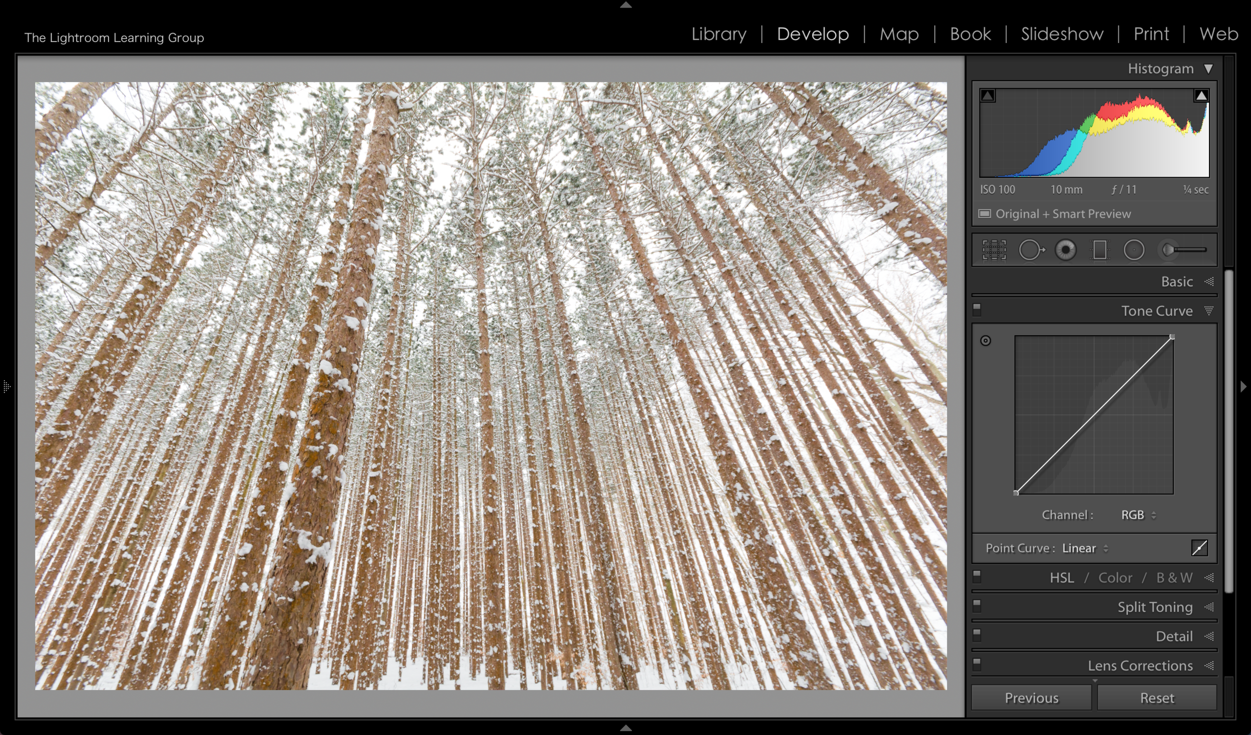
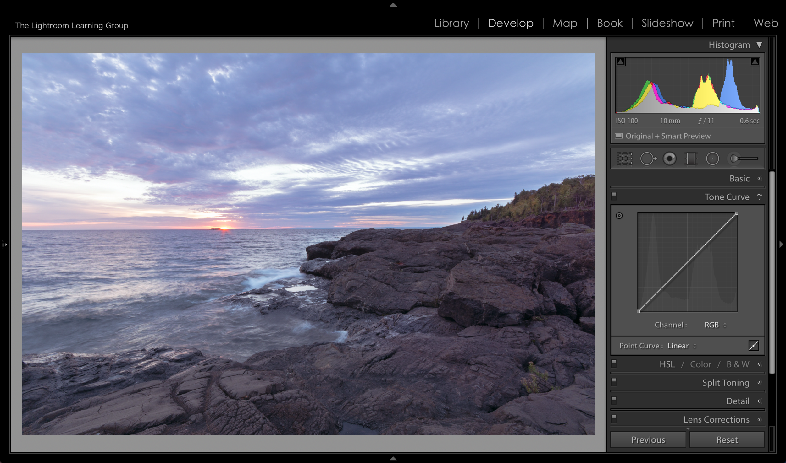
Just below the Basic Panel you will find the Tone Curve Panel. And what you are actually looking at is box with a diagonal line going from the bottom left to the upper right corner. This box represents the tone of the image, with the top of the box representing 100% White and the bottom of the box representing 100% Black. The diagonal line connects the black and the white tones and when you move the line the surrounding tones move with it - with ends or anchors remaining in place. So at the very basic level it can be used to brighten or darken your image. But of course, since this is Lightroom, it can do a lot more than that!
I think the best way to show you the Tone Curve via a blog is with pictures. So that's what we'll do.

Grabbing the center of the Curve line and pulling down will make your image darker. The farther you pull down, the darker the image will get. Note that next to Channel it indicated that we are working in RGB. This the default and you can work on individual colors, which we'll get to momentarily.

Grabbing and moving the line up will make your image brighter. When you grab in the middle you are essentially "grabbing" the midtones and you can see how it effects tones to the left and right of where you grab, with the effect being less toward the "anchors".
Now, you can move the anchor points but I don't really suggest you do (although I'll show you a cool trick in an upcoming video where you DO move an anchor point). In the images below you can see what happens when you move the anchor points to be directly across from each other - making a straight line. Other than helping to demonstrate where the highlights, midtones and blacks are on the Tone Curve box I don't see any other benefit to moving the anchor points - at least in such a dramatic way.
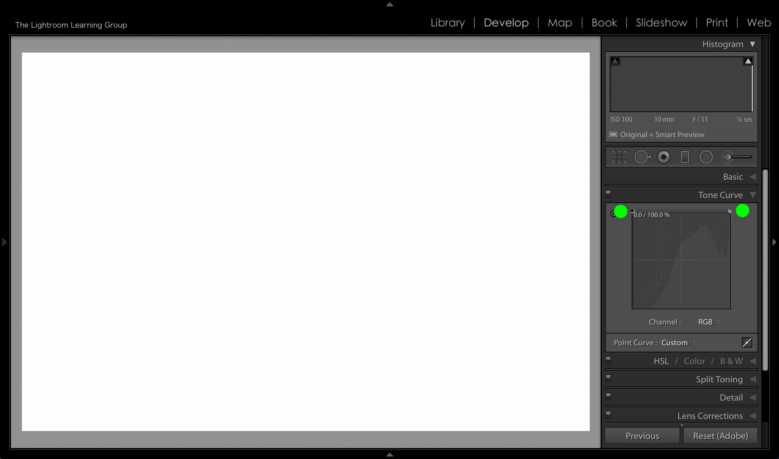
When you place each anchor point at the very top of the Tone Curve box your image becomes pure white.

When you place the anchor points across from each other in the very middle of the box you get a 50% gray image.

When you place the anchor points directly across from each other at the very bottom you will get a black image.
As we discussed earlier when you are in the RGB Channel you are adjusting all of the colors in the image. But you can click on the double arrow next to RGB and select individual color channels - Red, Green or Blue - and add different color tones.
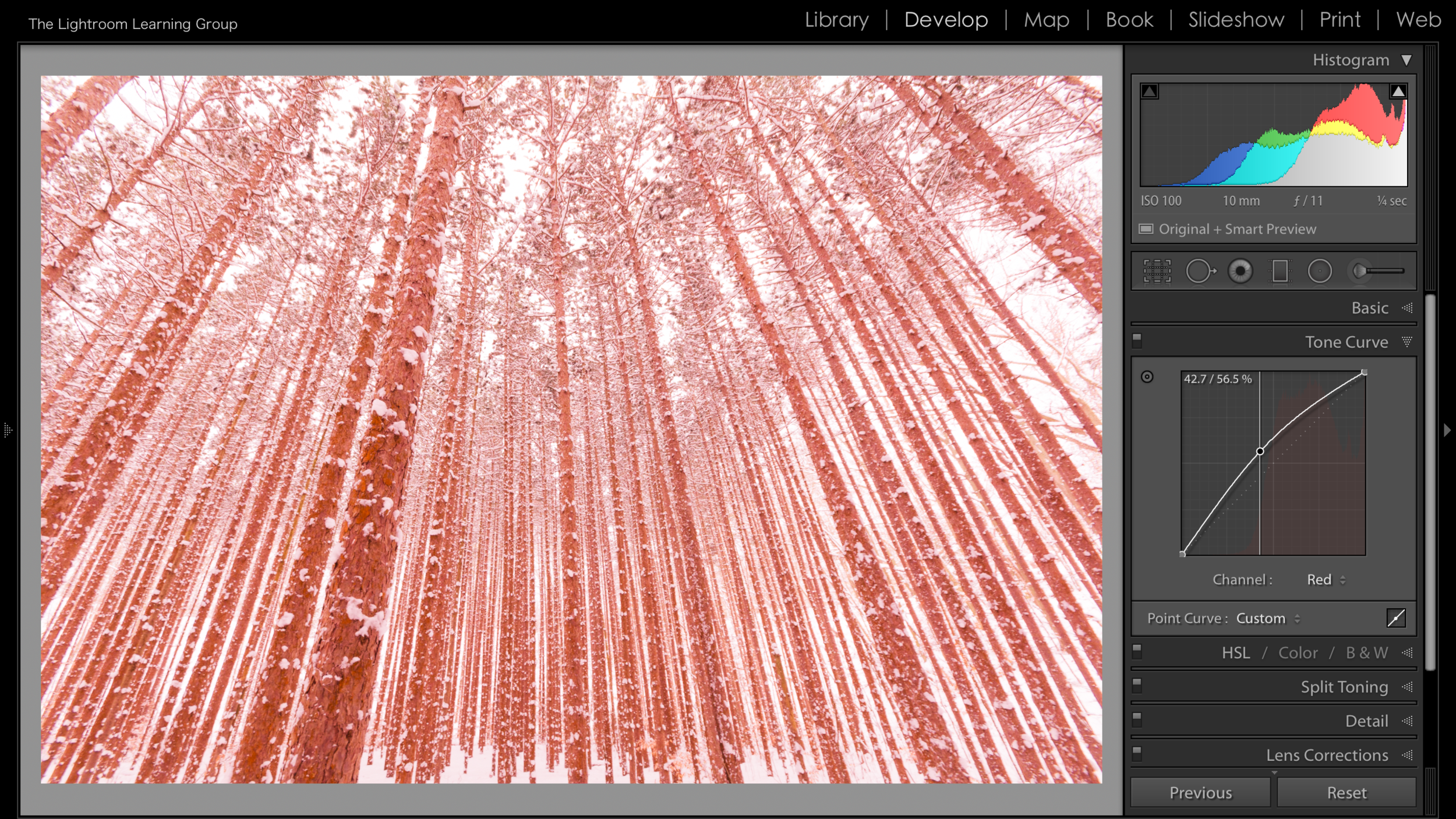
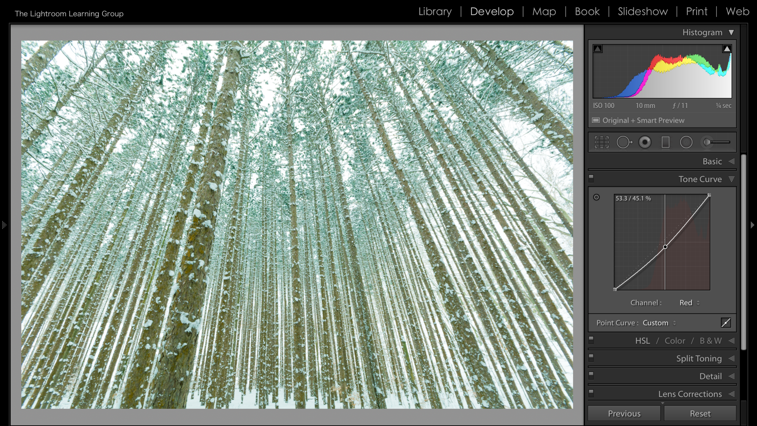
In the images above I chose to work on the Red channel and you can see that by moving the line in an upward direction Red is added to the image. When I pull down on the curve I am removing Red - essentially adding Cyan.
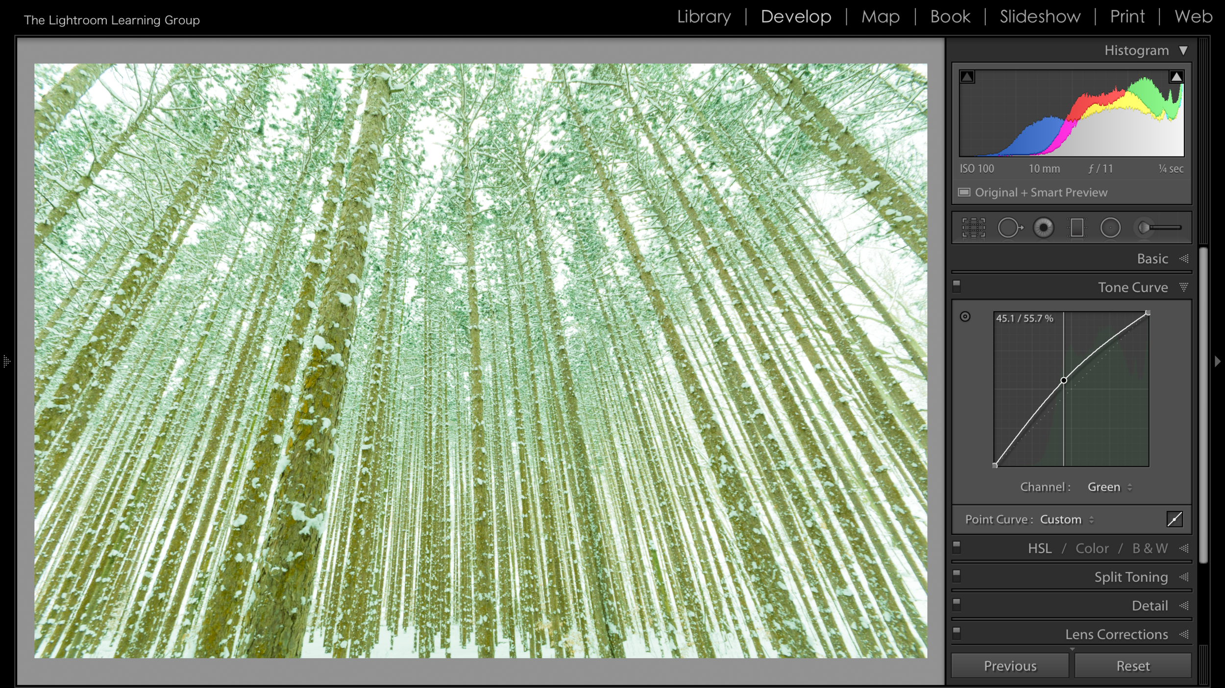
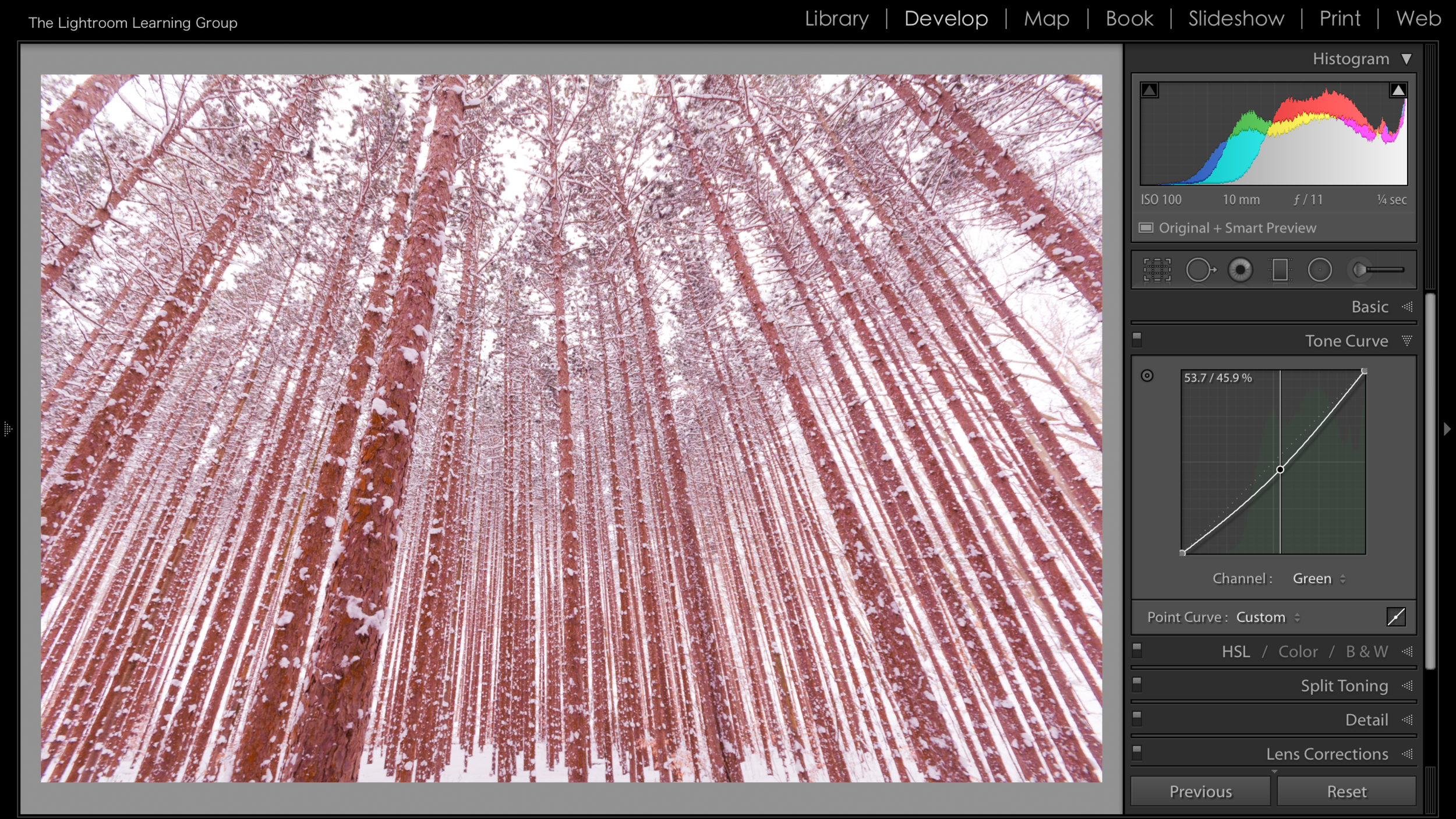
When we select the Green Channel and move the curve up we add Green and when we move it down we remove Green - or add Magenta.
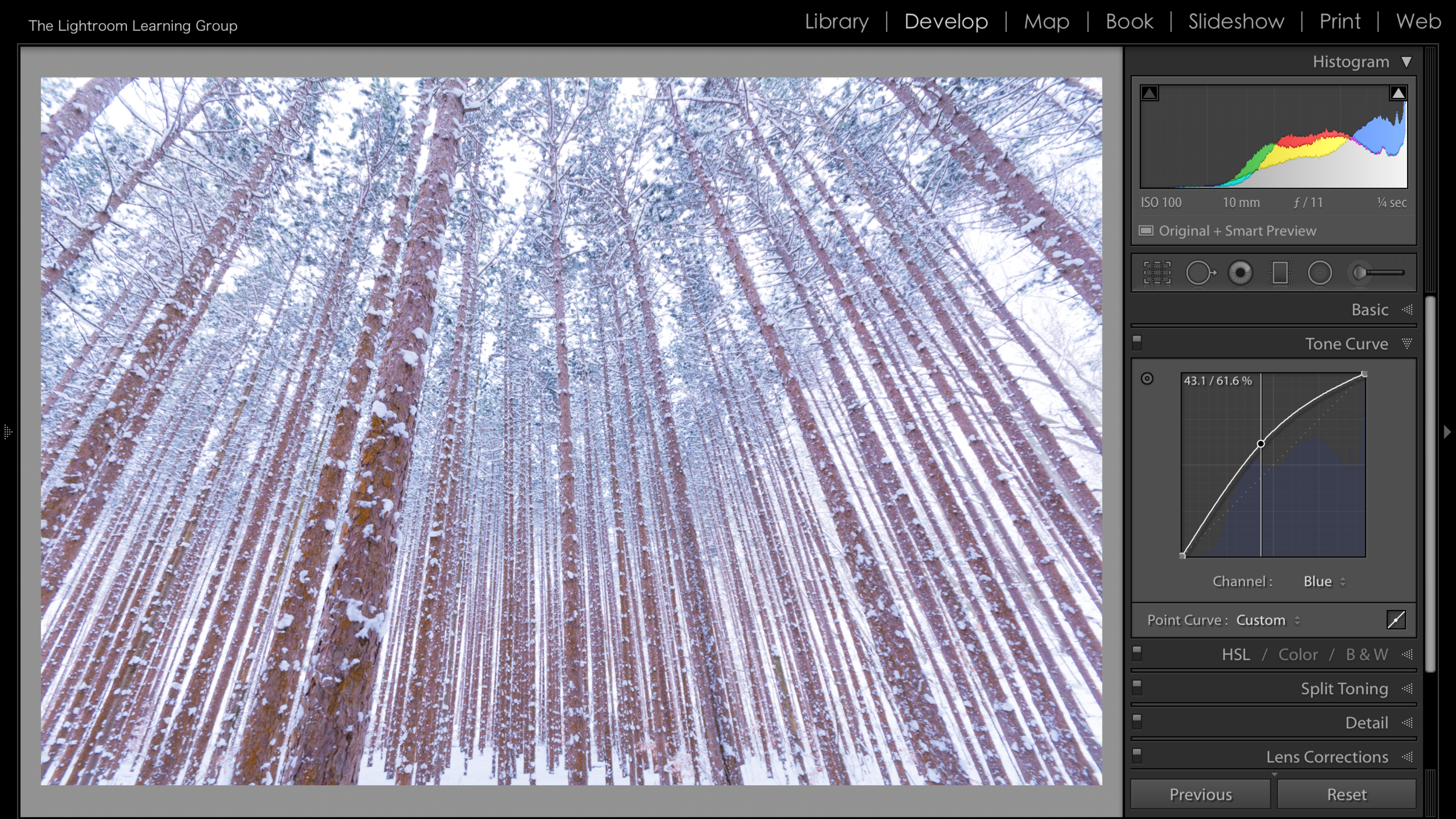
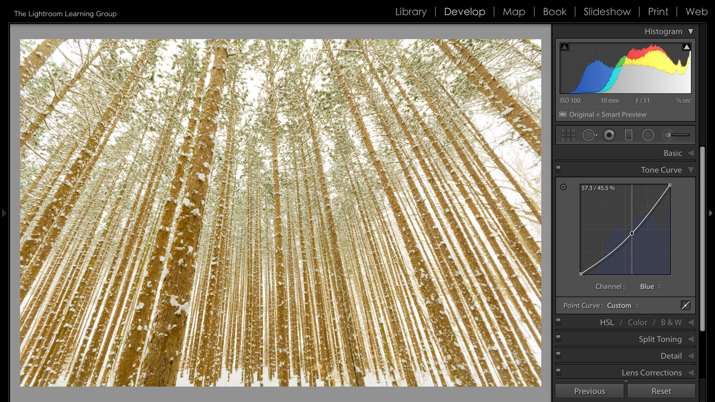
Lastly is the Blue Channel. And when the Curve is pulled up, Blue is added to your image. When it is pulled down, Blue is removed - or Yellow is added.
So you can see that there are definitely benefits to using the individual color channels - they're really nice for adding just a tint of color. But use the Curve with a delicate touch, a small move goes a LONG way.


You can also tap on the small Curve Box in the bottom right corner to open the Regions Slider(next to the green dot I placed in the image). This is fairly self explanatory and is of course rather similar to the sliders of the Basic Panel. I rarely use the sliders here in the Tone Curve. I just feel the Tone Curve is for clicking and grabbing, maybe it's the leftover Photoshop still left in me. If you want to use them go right ahead but I prefer not to.
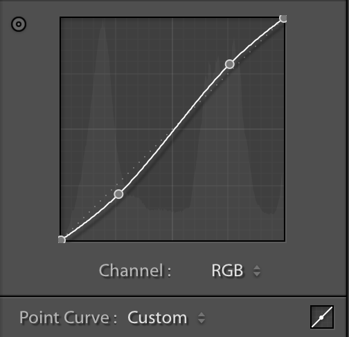
And now we can talk about my favorite way to use the Tone Curve. And that is to add contrast. There is something about using the Tone Curve instead of using the Contrast Slider of the Basic Panel that seems to give an image better contrast. It just seems to "pop" more, maybe it's just me. But if you look at the before and after image below (yes, I am excited that I can now use before/after slider on the website 🤓) you can see what adding a fairly gentle "S" curve does to an image.
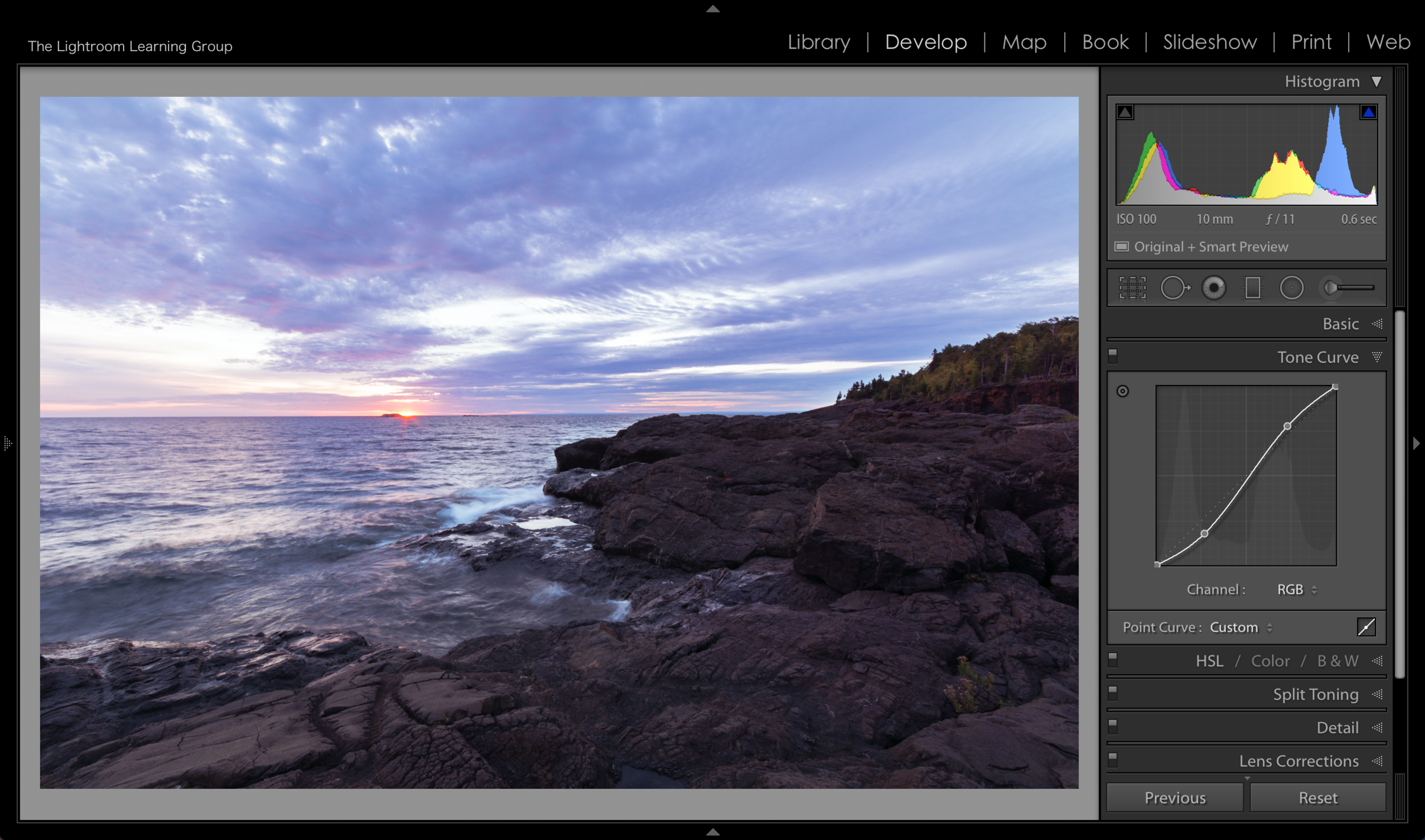
To create an "S" Curve you need to place 2 points on the curve. And this where the grid of the panel comes in handy. It is separated into 16 larger blocks (and 400 smaller blocks if you're counting). That leaves 3 converging points on the straight curve line (is that an oxymoron?), where the larger boxes meet. Thus you can easily picture the line in 3rds. You will generally get good results by placing a new anchor point on the first and last of the 3 converging points. Pull the first (lowest) point you placed down a little bit and pull the second (highest) point you placed up a little bit. This will create what appears to be a gentle "S" on the curve and add a pop of contrast.
There ya have it! Just about everything the Tone Curve has to offer! I know it's not an often used tool but give it a try, you might really like it!